

Soco Logo
The Soco logo was created to represent the app’s mission of improving communication within student organizations, with a focus on Greek life. Built from the anatomy of letters, the shapes were restructured to resemble two people in conversation, symbolizing connection and dialogue. The design reflects the app’s purpose of helping members communicate clearly, stay organized, and strengthen their community. Its bold, minimal style ensures the logo is versatile and recognizable across digital platforms, aligning seamlessly with Soco’s goals.
Soco Logo Anatomy

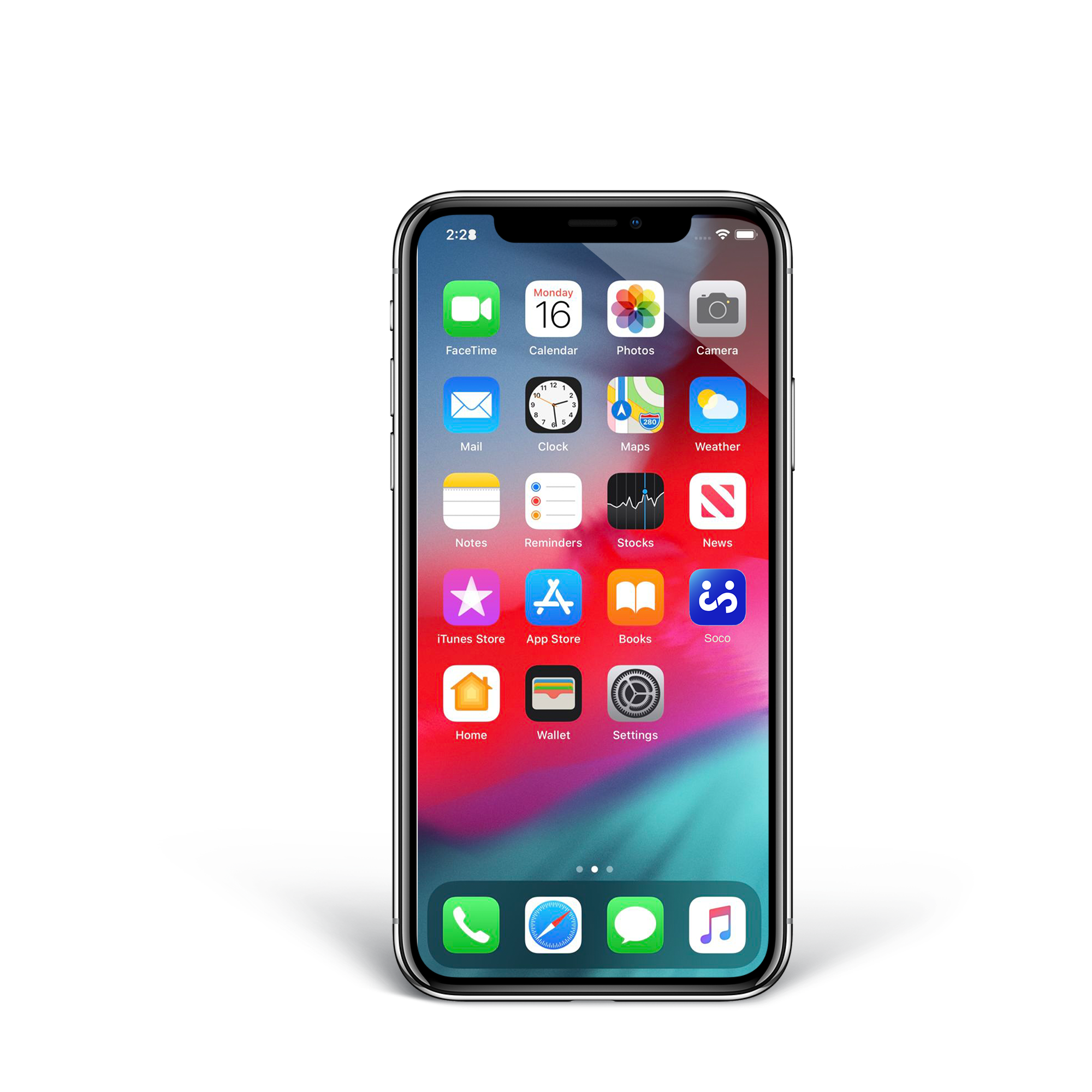
Soco App on Hompage
I designed this iPhone home screen mockup to showcase how the Soco app icon integrates into a real digital environment. Placing the icon among familiar apps emphasizes clarity, recognizability, and usability at a glance. The bold colors and simplified form stand out without clashing, ensuring the logo remains distinct on a crowded home screen.
Logo Iterations


Like what you see?