
Blinkies Glow-Up
Blinkies’ packaging was reimagined to modernize the brand and boost shelf appeal. Design and branding were paired with structural engineering from a team in China to create a package that stood out visually and functionally. Branded instructions and custom photography supported a successful Amazon launch.
Outcomes:
Modernized packaging design that increased shelf appeal and brand consistency
Successful Amazon launch with professional product photography
Enhanced customer experience through clear, branded instructions
Before & After
-

Before
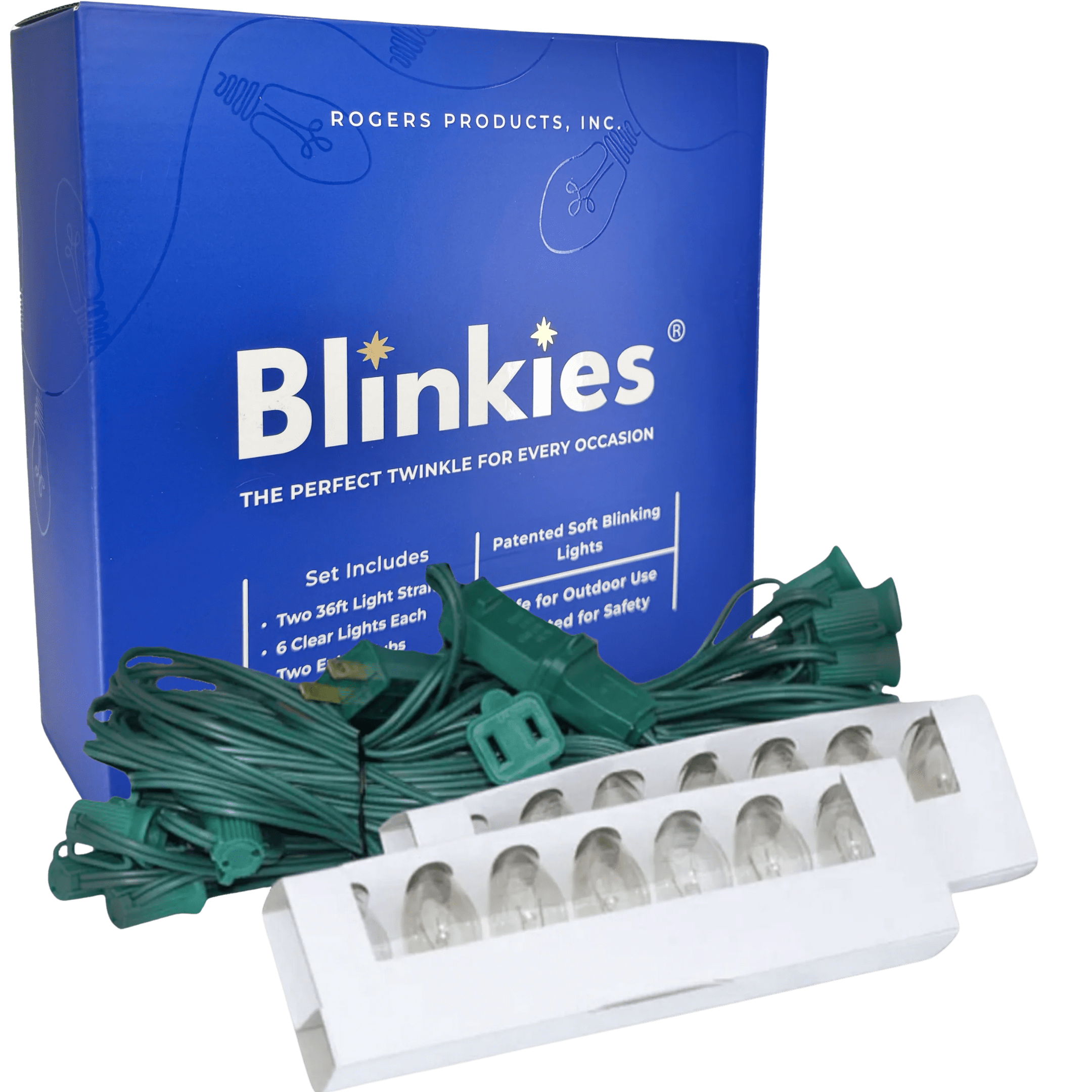
The original Blinkies packaging used an outdated illustration style that lacked clarity and modern appeal. It struggled to capture the target consumer’s attention and failed to stand out on crowded retail shelves.
-

After
The refresh maintained the brand’s signature blue color but introduced a cleaner, more structured layout with bold typography, refined iconography, and simplified details. I also incorporated my own custom bulb illustration to modernize the design while keeping it recognizable. A gloss layer was added to catch the light and echo the product’s twinkle, giving the packaging a polished finish.
Logo Development Process
-

First Draft
-

Second Draft
-

Final Logo
Like what you see?